A new look on the inside
Discreet from the exterior, Gallery Living's Mondrian 230 hides a new perspective once you are indoors

I love homes that don't give anything away from the outside. Case in point is Gallery Living's new Mondrian 230 design, which is on display at Miravale, in the increasingly bustling northern suburb of Angle Vale. From the street, this looks like a squarish design set on a corner block, and on arrival I initially struggled to find the front door, despite the double garage being in sight. I soon worked it out. This entrance is located around the corner and while it isn't that conventional in Australia it did remind me of many New Zealand homes where typically the entrance is along one side of the house.
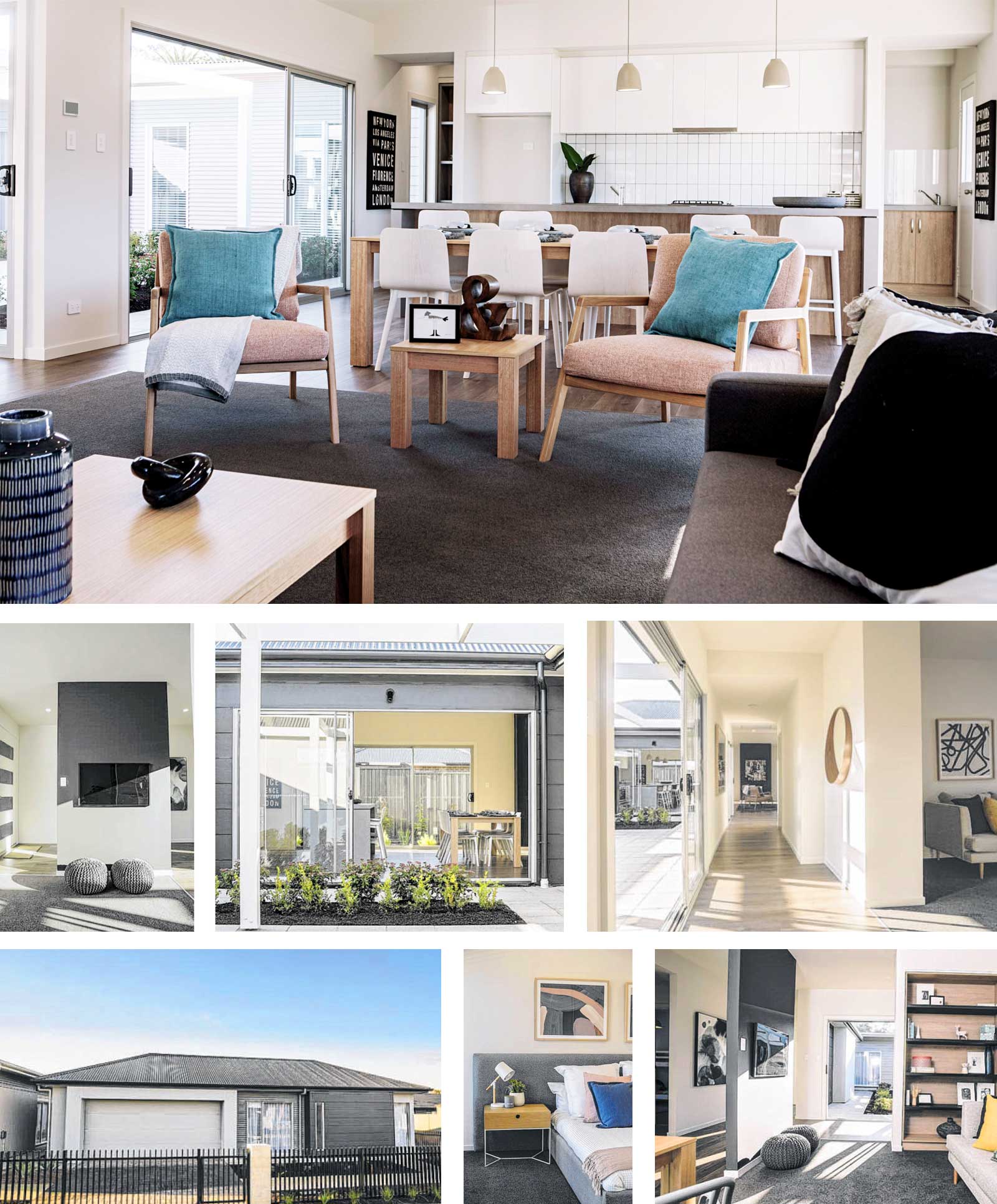
Anyway, with the entrance found, I proceeded with my walk through and that's where this home takes on a new perspective. The three -bedroom, two-bathroom Mondrian 230 is all about an inside-out connection and that's only apparent once you are indoors. Privacy is a priority and from the street, the tall narrow windows don't give much away. The layout essentially follows a U shape, or C shape, depending on how you look at it, with the home comprising three sides which form around a central courtyard. On most suburban blocks this would become your main outdoor space/garden, but if you chose to build this design on a bigger allotment the layout would allow it to take advantage of views from any part of the home.
The first thing that strikes as soon as you enter is you can see straight ahead to the outdoors and this courtyard that is pivotal to the design. The second is how warm the home feels. To the right, a carpet clad (Tuftmaster 's Gulls Way in colour Evening Shadow) open study makes a snug space with room for a couch, desk and built-in bookshelf that anchors it nicely. A partition wall in matt black is a clever divider from the entry, as it allows you to see outside from any angle but also creates a space to wall-hang the television.
To the left is the first of the home 's three bedrooms and this one has a corner window which draws in the light. Again soft carpet dresses both this and the following bedroom, of equal size, and both come standard with built-in wardrobes and have easy access to the main bathroom which sits in between.
At this stage, I'm still in the first part of the U section and another doorway leads to the double garage which faces the street. From any part of this short hall the courtyard dominates your view via a series of full length windows and sliding doors, and it's a delightful change from the conventional layout of many modern homes. Gallery Living's marketing manager Jaye Smith says this centra l courtyard is a staple element of many of their designs.
"The courtyard is a multi-layered space, working to integrate the three distinct zones of the home with a communal space and providing a perfect entertaining or play area," she says. "Accessible from multiple points within the home, the courtyard can be a private garden sanctuary, or an entertainer's dream courtyard, all while providing a primary function of enabling the flow of natural light and air throughout the home.
The strength of this space is in its flexibility." Follow the window-lined hallway along the central part of the design and the master bedroom comes into view and takes up the majority of this section, with the except ion of a couple of integrated linen cupboards. The master has two sets of built-in wardrobes - always handy when you have a lot of clothing - and around the corner, the ensuite is bigger than some main bathrooms.
A long vanity with a huge mirror, a secluded walk-in shower with shelf, generous floorplace and a wall-mounted freestanding (Caroma's Urbane) bath are among the luxury touches. "When you are looking to get away, the master suite is quietly tucked away to the side of the central corridor, hiding an impressively spacious bedroom and light-filled ensuite with a feature bath for soaking away your stresses," Jaye says.
The third section of the design is the living hub and while the rest of the home is treated to 2.7m ceilings, here it rises to a 3.2m vaulted ceiling. I was quite entranced by this interesting roofline and its angles which I think add sophistication. Jaye says the vaulted ceiling is a cost -effective way of making a dramatic statement without wasting precious floorspace.
The family lounge/dining and kitchen combine in this large space, where from any point in it you can count at least seven full-length windows or sliding doors, connecting both the central courtyard and the rear-facing garden. Light isn't an issue and it feels warm and homely, dressed in soft pastels, dark carpet and a wall mounted fireplace is a focal point that zones the dining from the lounge.
"The layout of the Mondrian is centred on the interaction of the courtyard with the open plan living/dining/kitchen space," Jaye says. "The natural light that fills the home is the hero, and the styling has been chosen to complement that. Pops of colour were introduced in the soft furnishings, using a mix of textures and a broad colour palette to create warm and inviting spaces throughout the home." At the far end, the kitchen with its long island bench dominates in soft grey and white , with rows of drawers and appliances discreetly placed out of sight in the island. Hard-wearing Laminex in Basalt grey was chosen for the benchtop, paired with Laminex Rural Oak on lower drawers and Polar White in a silk finish on upper cupboards.
Following the style, two smart spaces sit either side behind sliding doors at the rear of the kitchen: a well-dressed laundry on one side and an equally stylish walk-in pantry with stacks of shelves, cupboards and a handy benchtop. "The kitchen is the hub of the home and surrounding this hub with all your utility and storage areas means you have a functional and convenient space for all your everyday living needs," Jaye says. "Rather than a traditional laundry room, which is located out the back by the secondary bedrooms, running it off of the kitchen makes it a usable and convenient space for additional storage as well as an easily accessible laundry room that helps you to multitask. "
The courtyard is a functional area flowing from the living space for a perfect entertaining area, or a safe space for kids to play in the centre of the home.
It's easy to work out homebuyers for this midsize design, planned to suit a minimum block of 16m x 30m, will be after a lifestyle change, a home that follows the aspect and offers energy efficiency, cross ventilation and other practical eco solutions. "The Mondrian is a perfect home for smaller families or those wanting to downsize," she says. "The courtyard creates a double opportunity at capturing the winter sun, bringing the warmth into both the rear living space and the rooms along the front of the home that would be blocked off from this natural resource with a more traditional floorplan. During summer when the sun is higher, the roofline and eaves stop the direct sun from coming into the home, and the courtyard allows natural airflow to cool the home."
Features you'll love
LUXURY EXTRAS: The Mondrian 230 display showcases mainly its standard specification with a few splashes of luxury, such as the 3.2m vaulted ceiling, the freestanding bath in the ensuite and the tiled external feature wall to the front porch.
OPTIONS AVAILABLE: The Mondrian 230 has the option of a traditional front entrance layout instead of the side entry as displayed at Miravale.
ON THE OUTSIDE: Making a point of difference on the street. the Mondrian is clad in James Hardie Stria 325mm in colour Monument; True Oak - Deep in Windspray; and Hebel Powerpane ls in Shale Grey.
27-Sep-20 - The Sunday Mail Home Magazine
Find out more about the Mondrian 230


