A stand out on the street

A stand out on the street

A stand out on the street

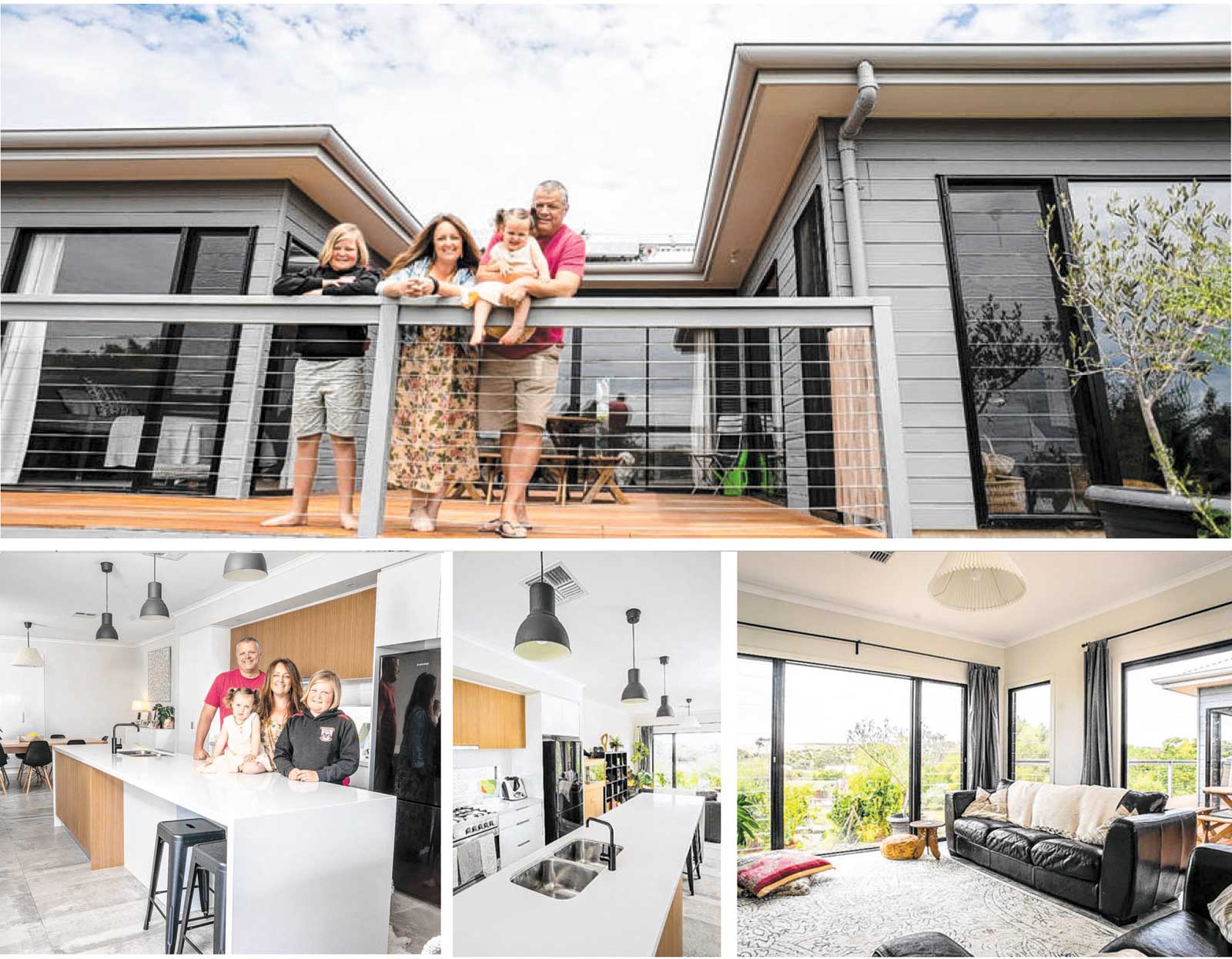
This Mt Barker couple enjoyed a smooth build experience when they chose Gallery Living to create their new home
A stand out on the street the Picasso

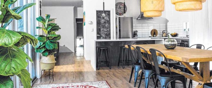
With plenty of experience on new house builds, plumber Sean King was determined -yet not overly confident -that his own home build should go. exactly to plan. "I actually met the work supervisor on site, which is a pretty unusual thing to do (for home builders), to tell him, face-to-face, how much of a pain in the butt I might be -I wanted to pre warn him," Sean says. "I've been on millions of build sites and I was pretty pessimistic going into (this build). "I know how many issues people have with a lot of the builders out there."

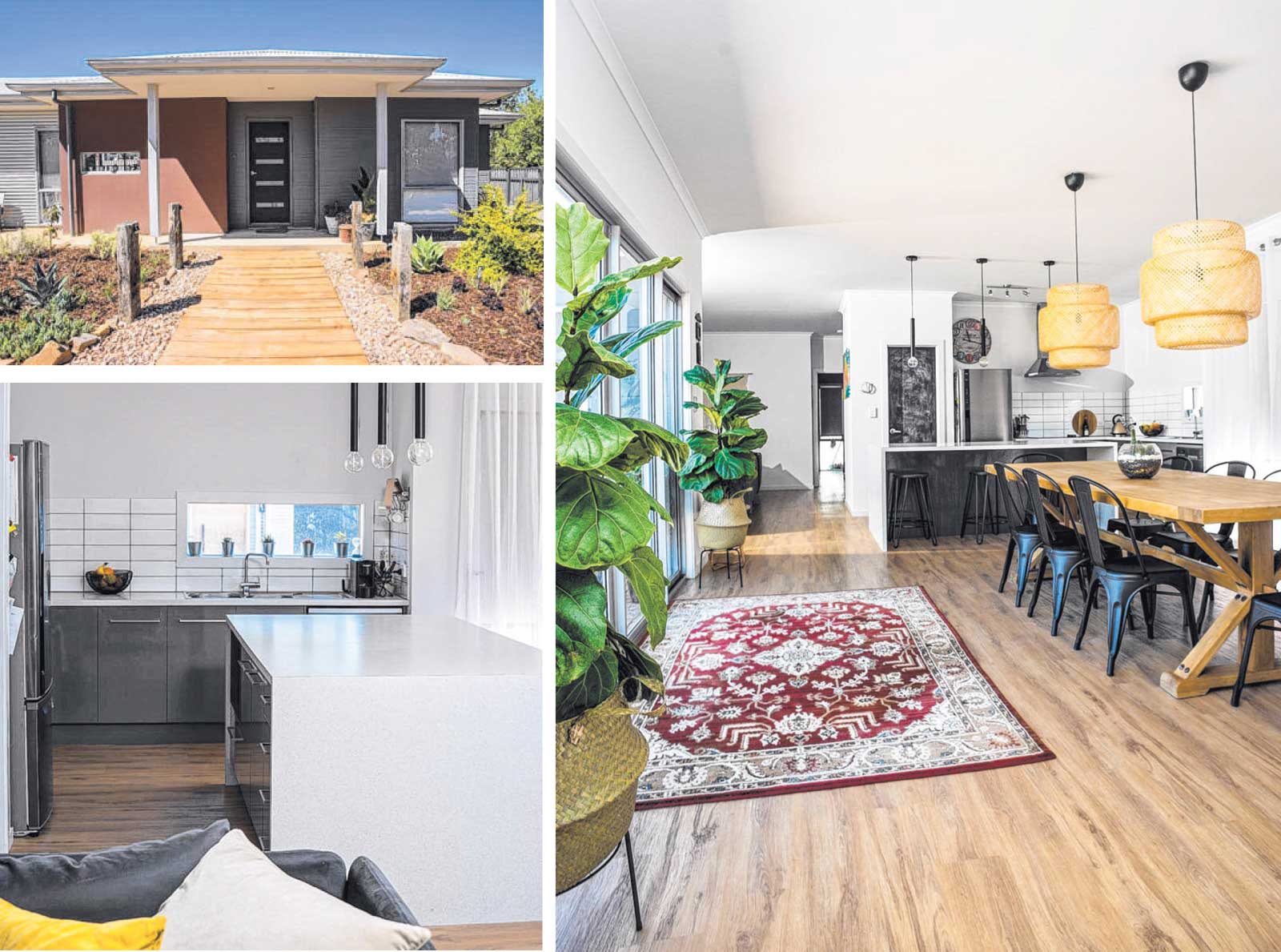
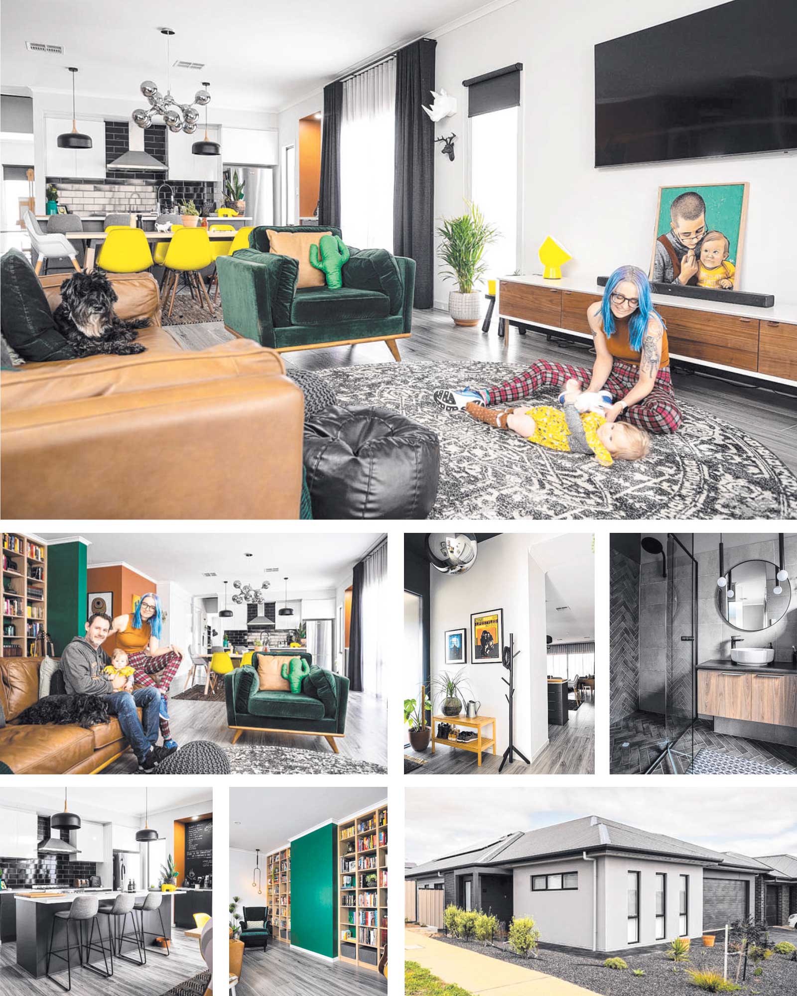
To Sean's surprise, his own experience was virtually problem-free, which he attributes to the professionalism of his builder, Gallery Living. Sean and his painter-decorator wife Kelly wanted to build a unique home for their Mt Barker corner block, that resembled nothing else on their street, and chose Gallery Living for the array of building materials they use, including heel. After selecting Gallery Living's Picasso 200 four-bedroom, two-bathroom design as the base, the couple set about modifying it to make it one of a kind.

They started by removing the fourth bedroom and the laundry, then slightly increased the double garage to install a European-style laundry there. The extra floor space created by eliminating
two rooms allowed the kitchen to be relocated and its orientation rotated 90 degrees so that the breakfast bar faced into the dining and living areas. A walk-through wardrobe, connecting the master bedroom and ensuite, was included in the modified plans, as well as a dedicated library space with nooks for book shelves in the living zone.

Sean says Gallery Living accommodated all their changes, enabling the couple to build a bigger home than originally anticipated and one that they will likely remain in long-term. "Our original plan was to build a small home and then step up (and build a family home later)," Sean says. "But the process ( of modifying the plans) was absolutely awesome. Everything we wanted to do, (the sales consultant) said yes, we could do that. '"If we'd had a salesperson that wasn't interested, and was annoyed with making changes, and wasn't willing to get us through all that, it wouldn't have worked (as successfully).

'With the work (to modify the plans), and the build, we're now of the opinion that we've built our forever home." Sean and Kelly, who welcomed daughter Saga shortly after moving in, now have a beautiful home, with a bold colour scheme that includes feature walls in terracotta, emerald green and navy. "(The decorating style) was all Kelly," says Sean, who saved considerable expenses by undertaking work on the retaining walls and other tasks, like installing the skirting boards, himself. "It looks really, really great. I'm proud of what Kelly has done -she did an incredible job with it."

The couple say they achieved their one-of-a­kind dream home and, given the chance to do it again, would only change the concreting outside from black to a more eye-catching aggregate. "If you drive down our street, our house stands out from everyone else in the entire street," Sean says. "It's the perfect place for us."

Features you'll love

European laundry: These homeowners didn't want to waste precious space on a separate laundry room so opted for a European-style laundry in the garage.

High-performance hebel: Building with hebel provides a greater choice of textures, finishes and colours for your home. It also has excellent insulation qualities, which mean lower home heating and cooling costs. and is a good option for bushfire-prone areas.

One of a kind: Ready-to-build plans are a great start but. if you want a home that perfectly matches your needs, make sure you find a builder who is happy to accommodate any changes.


31-Jan-20 - The Sunday Mail Home Magazine

This exact house model is no longer available, to see a similar house please view the  Picasso 195.


A new outlook on the inside

A new outlook on the inside the Mondiran

A new look on the inside

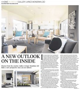
Discreet from the exterior, Gallery Living's Mondrian 230 hides a new perspective once you are indoors

A new outlook on the inside the Mondiran 230

I love homes that don't give anything away from the outside. Case in point is Gallery Living's new Mondrian 230 design, which is on display at Miravale, in the increasingly bustling northern suburb of Angle Vale. From the street, this looks like a squarish design set on a corner block, and on arrival I initially struggled to find the front door, despite the double garage being in sight. I soon worked it out. This entrance is located around the corner and while it isn't that conventional in Australia it did remind me of many New Zealand homes where typically the entrance is along one side of the house.

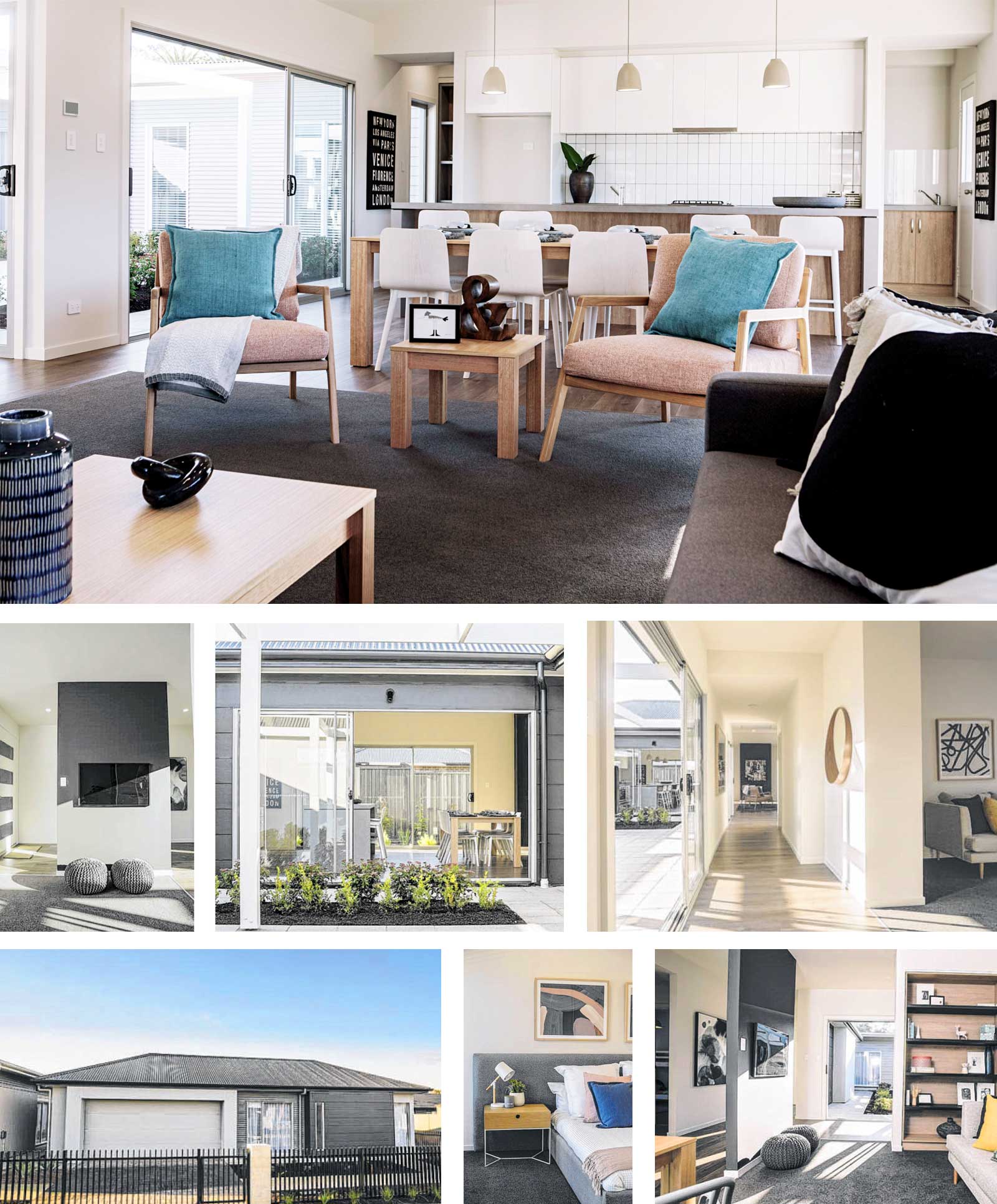
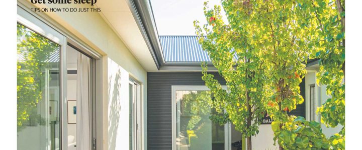
Anyway, with the entrance found, I proceeded with my walk through and that's where this home takes on a new perspective. The three -bedroom, two-bathroom Mondrian 230 is all about an inside-out connection and that's only apparent once you are indoors. Privacy is a priority and from the street, the tall narrow windows don't give much away. The layout essentially follows a U shape, or C shape, depending on how you look at it, with the home comprising three sides which form around a central courtyard. On most suburban blocks this would become your main outdoor space/garden, but if you chose to build this design on a bigger allotment the layout would allow it to take advantage of views from any part of the home.

The first thing that strikes as soon as you enter is you can see straight ahead to the outdoors and this courtyard that is pivotal to the design. The second is how warm the home feels. To the right, a carpet clad (Tuftmaster 's Gulls Way in colour Evening Shadow) open study makes a snug space with room for a couch, desk and built-in bookshelf that anchors it nicely. A partition wall in matt black is a clever divider from the entry, as it allows you to see outside from any angle but also creates a space to wall-hang the television.

To the left is the first of the home 's three bedrooms and this one has a corner window which draws in the light. Again soft carpet dresses both this and the following bedroom, of equal size, and both come standard with built-in wardrobes and have easy access to the main bathroom which sits in between.

At this stage, I'm still in the first part of the U section and another doorway leads to the double garage which faces the street. From any part of this short hall the courtyard dominates your view via a series of full length windows and sliding doors, and it's a delightful change from the conventional layout of many modern homes. Gallery Living's marketing manager Jaye Smith says this centra l courtyard is a staple element of many of their designs.

"The courtyard is a multi-layered space, working to integrate the three distinct zones of the home with a communal space and providing a perfect entertaining or play area," she says. "Accessible from multiple points within the home, the courtyard can be a private garden sanctuary, or an entertainer's dream courtyard, all while providing a primary function of enabling the flow of natural light and air throughout the home.

The strength of this space is in its flexibility." Follow the window-lined hallway along the central part of the design and the master bedroom comes into view and takes up the majority of this section, with the except ion of a couple of integrated linen cupboards. The master has two sets of built-in wardrobes - always handy when you have a lot of clothing - and around the corner, the ensuite is bigger than some main bathrooms.

A long vanity with a huge mirror, a secluded walk-in shower with shelf, generous floorplace and a wall-mounted freestanding (Caroma's Urbane) bath are among the luxury touches. "When you are looking to get away, the master suite is quietly tucked away to the side of the central corridor, hiding an impressively spacious bedroom and light-filled ensuite with a feature bath for soaking away your stresses," Jaye says.

The third section of the design is the living hub and while the rest of the home is treated to 2.7m ceilings, here it rises to a 3.2m vaulted ceiling. I was quite entranced by this interesting roofline and its angles which I think add sophistication. Jaye says the vaulted ceiling is a cost -effective way of making a dramatic statement without wasting precious floorspace.

The family lounge/dining and kitchen combine in this large space, where from any point in it you can count at least seven full-length windows or sliding doors, connecting both the central courtyard and the rear-facing garden. Light isn't an issue and it feels warm and homely, dressed in soft pastels, dark carpet and a wall mounted fireplace is a focal point that zones the dining from the lounge.

"The layout of the Mondrian is centred on the interaction of the courtyard with the open plan living/dining/kitchen space," Jaye says. "The natural light that fills the home is the hero, and the styling has been chosen to complement that. Pops of colour were introduced in the soft furnishings, using a mix of textures and a broad colour palette to create warm and inviting spaces throughout the home." At the far end, the kitchen with its long island bench dominates in soft grey and white , with rows of drawers and appliances discreetly placed out of sight in the island. Hard-wearing Laminex in Basalt grey was chosen for the benchtop, paired with Laminex Rural Oak on lower drawers and Polar White in a silk finish on upper cupboards.

Following the style, two smart spaces sit either side behind sliding doors at the rear of the kitchen: a well-dressed laundry on one side and an equally stylish walk-in pantry with stacks of shelves, cupboards and a handy benchtop. "The kitchen is the hub of the home and surrounding this hub with all your utility and storage areas means you have a functional and convenient space for all your everyday living needs," Jaye says. "Rather than a traditional laundry room, which is located out the back by the secondary bedrooms, running it off of the kitchen makes it a usable and convenient space for additional storage as well as an easily accessible laundry room that helps you to multitask. "

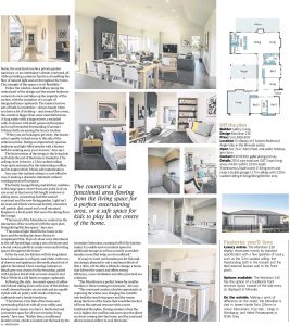
The courtyard is a functional area flowing from the living space for a perfect entertaining area, or a safe space for kids to play in the centre of the home.

It's easy to work out homebuyers for this midsize design, planned to suit a minimum block of 16m x 30m, will be after a lifestyle change, a home that follows the aspect and offers energy efficiency, cross ventilation and other practical eco solutions. "The Mondrian is a perfect home for smaller families or those wanting to downsize," she says. "The courtyard creates a double opportunity at capturing the winter sun, bringing the warmth into both the rear living space and the rooms along the front of the home that would be blocked off from this natural resource with a more traditional floorplan. During summer when the sun is higher, the roofline and eaves stop the direct sun from coming into the home, and the courtyard allows natural airflow to cool the home."

Features you'll love

LUXURY EXTRAS: The Mondrian 230 display showcases mainly its standard specification with a few splashes of luxury, such as the 3.2m vaulted ceiling, the freestanding bath in the ensuite and the tiled external feature wall to the front porch.

OPTIONS AVAILABLE: The Mondrian 230 has the option of a traditional front entrance layout instead of the side entry as displayed at Miravale.

ON THE OUTSIDE: Making a point of difference on the street. the Mondrian is clad in James Hardie Stria 325mm in colour Monument; True Oak - Deep in Windspray; and Hebel Powerpane ls in Shale Grey.


27-Sep-20 - The Sunday Mail Home Magazine

Find out more about the Mondrian 230


You’ll never want to leave

You'll never want to leave the Picasso 250

You'll never want to leave

You'll never want to leave the Picasso 250

Everyday life has a feeling of turmoil at the moment , so it's no wonder we're placing greater emphasis on the feel and safety of our homes and properties. Speaking from experience, I can say I've never spent more time in my backyard and garden as I have this year.

It seems I'm not alone, with many homeowners looking to integrate their indoor spaces with the outdoors to create calming havens away from the stress of day-to-day living. When it comes to building a new home on a courtyard allotment that incorporates these features, one design that does it extremely well is

Gallery Living's Picasso 250. Measuring 14.2m wide and 24.3m deep, this three-bedroom, two-bathroom, double garage design offers a peaceful retreat for families looking to upgrade their lifestyle.

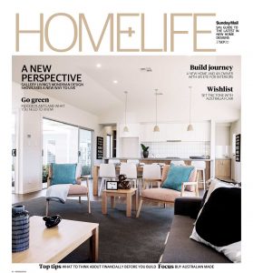
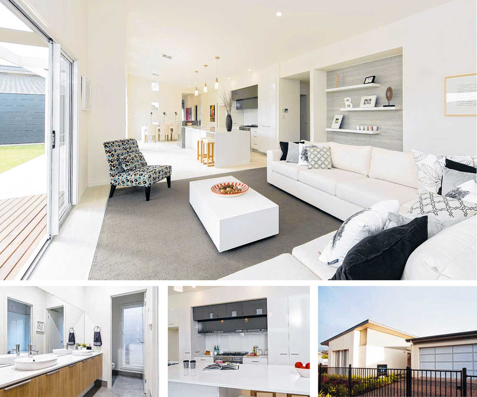
The Picasso 250 design by Gallery Living is a beautiful family home that offers a relaxed retreat from the outside world

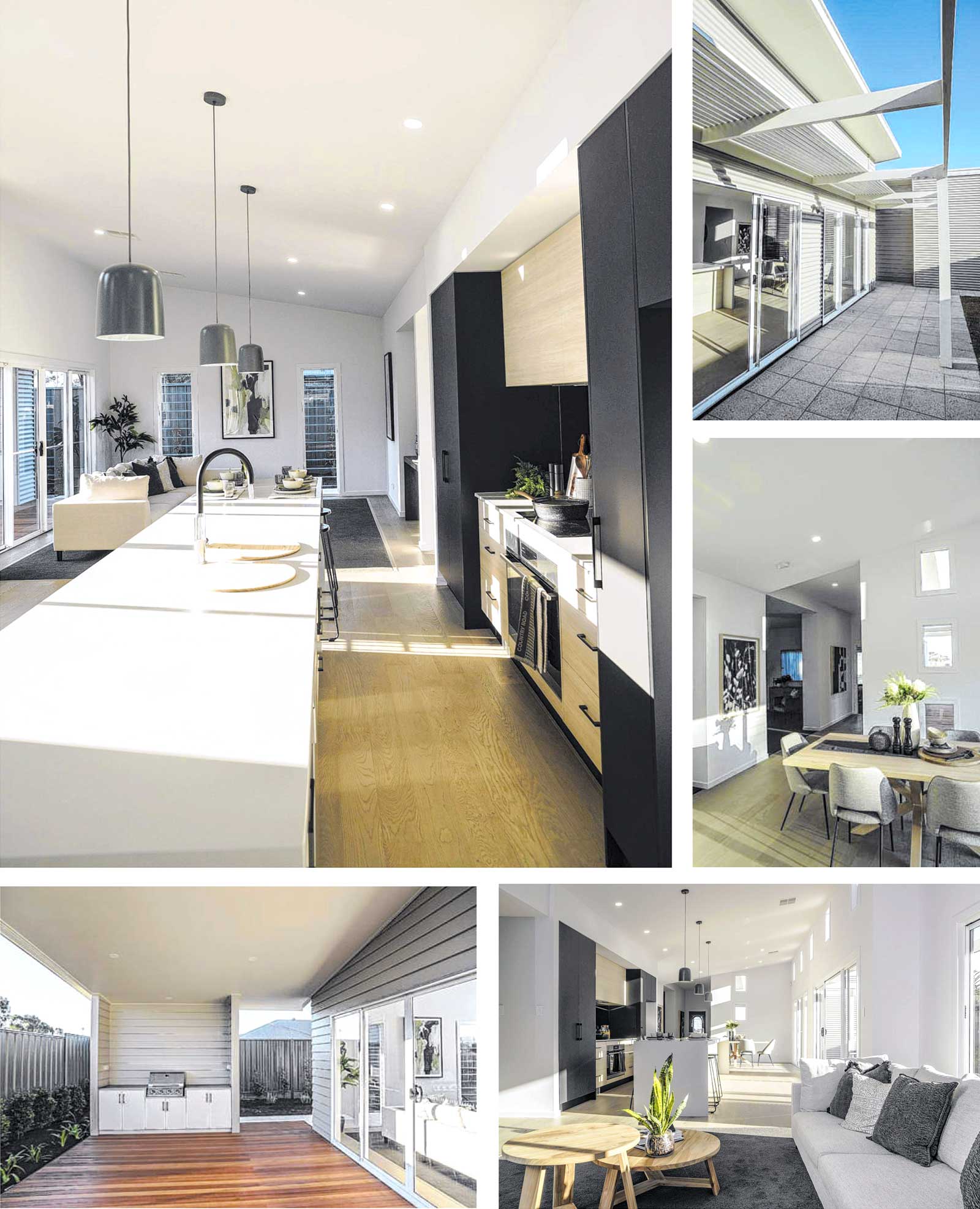
From the moment you walk into the home , which is on display at Miravale at Angle Vale, a feeling of calm sweeps over your body and mind. Gallery Living's marketing manager Jaye Smith says this relaxing effect is largely due to the amount of natural light that floods the design, created by the mono pitch roofline, angled to take advantage of the northern aspect.

"The Picasso 250 is designed to capture and distribute natural light throughout the home, particularly in the open-plan living area," she says. 'With its soaring raked ceiling, highlight windows and wide opening sliding doors seamlessly connecting with the side yard, this home gives its owners all the benefits and mood brightening that sunlight brings into a home, all year round. "

It's not often I find myself struggling to leave a room when visiting a display, however the Picasso 250's master suite has a certain charm, and again it's all to do with the light. "The master bedroom is located at the front of the home, with a spacious ensuite, featuring a Velux skylight to allow light to flow into the room but retain privacy ," Jaye says. The addition of a wall-to-wall built-in robe provides a discreetly functional element to a room that feels nothing short of tranquil, which is just what you should hope for in a bedroom.

Move back towards the main living space, you'll find there 's also a private lounge and a home office - a space which will make working from home something to look forward to. However, the main attraction in this design is undoubtedly the long open-plan kitchen , dining and living area , which features a high , angled ceiling.

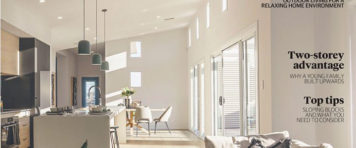
This part of the home has a skillion roof, measuring 3.6m at its highest point, taking the spacious feel to a whole new level. That together with the abundance of high windows and sliding doors creates a light-flooded haven. The structural elements in this space also lend to the comforting ambience, as does the colour palette and furnishings.

"The interior has a crisp white internal paint palette which highlights the architectural elements within the home ," Jaye says. "The soft furnishings pick up on the earthy tones of the external colour scheme , with natural elements like leather and wood, complemented by the statement pops of dark olive green." An interesting feature in this space is the use of a carpeted segment in the living area, a cosy contrast to the stylish Quickstep compact flooring in cliff grey oak, extra matt, which covers the rest of the space. "Installing a carpeted section to the lounge area makes the area cosy underfoot and helps to define' the space and make it feel larger," Jaye says.

Keen entertainers will love the amount of space and storage on offer in the sleek galley kitchen,c omplete with a handy double sided breakfast bar at one end for mealtime. Overlooking the alfresco (optional), this part of the home will completely open to the yard - perfect for making the most of the warmer months ahead.

The remaining two bedrooms are down another hallway beside the kitchen, both with built -in robes and proximity to the laundry and main bathroom.

For home builders looking for inspiration, visiting the Miravale display is a must. Jaye says this display offers an inspirational delivery of the  design, showcasing how non -standard items can transform the home. "The display at Miravale includes some architectural upgrades, like additional dropped ceilings, bulkheads and window upgrades, as well as smaller fixture and fittings upgrades like tapware, kitchen appliances and benchtops," she says.

On face value, the Picasso 250 is a beautiful family home that offers a relaxed retreat from the outside world. However, it's important to not look past the array of energy efficient features. "All Gallery Living homes come with integrated solar power included in the price," Jaye says. "We make sure your new home takes advantage of the natural environment, for better energy efficiency and a lower carbon footprint.

"The orientation of your block is integral to the long-term performance of your home, so we will work closely with you to make the most of your asset and create the most comfortable environment possible."

We make sure your new home takes advantage of the natural environment

Features you'll love

NATURAL LIGHT: The mono pitch roofline allows an abundance of natural light in the Picasso 250 creating a calming retreat , no matter what part of the home you are spending time in.

PARENTS' RETREAT: The master suite offers a private retreat for parents, complete with a generous wall-to-wall built-in robe and a stylish ensuite with a long double vanity and shower .

ROOM TO MOVE: The Picasso 250's wide sliding doors completely open the space to the side yard , meaning you can integrate with the outdoors with ease.

RELAXING TONES: The crisp white interior is complemented by ashy-toned flooring and cabinetry, providing a warm , welcoming space.


23-Aug-20 - The Sunday Mail Home Magazine

Find out more about the Picasso 250


Modern Masterpiece

The Picasso 250 a Modern Masterpiece

Modern Masterpiece

The Picasso 250 a Modern Masterpiece

Like its famous artistic namesake, Gallery Living's light -filled and spacious Picasso 250 sets a benchmark in contemporary cool. Designed with the demands of the growing family in mind, the home's flexible floorplan boasts three good -sized bedrooms and two bathrooms, while a separate study and second lounge room provide ideal areas in which to find your own space if and when required.

The hub of the home is its open -plan kitchen/living/dining area, which is bathed in the natural light that floods in through the additional highlight windows along its full length. The well-appointed modern kitchen is the centrepiece of the open -plan space, looking out over a long island bench through boutique, wide opening sliding doors to the sunlit yard - complete with a decked alfresco area and outdoor kitchen, ideal for entertaining.

Along with the windows, the stunning raked ceiling adds to the home's overall sense of spaciousness

Another feature of the Picasso is its stunning raked ceiling, which lifts the living area with a showstopping 3.6m height at its peak. Along with the windows, this helps adds to the home's overall sense of spaciousness.

Natural light is also a feature of the luxurious master bedroom - which boasts a skylight in the spacious ensuite - as well as a generous wall-to wall built -in robe. The master bedroom has been cleverly positioned at the front of the home , away from the rest of the family living spaces. The sunlight captured throughout the day means your reliance on Gallery Living's integrated solar panel system for lighting and heating/ cooling is considerably reduced.

Other features of the design includes the handy double garage , which is separated from the rest of the house by a porch.


19-Jul-20 - The Sunday Mail Home Magazine

Find out more about the Picasso 250 (South).


Connect with nature

Miro 280 - connect with nature

Connect with nature

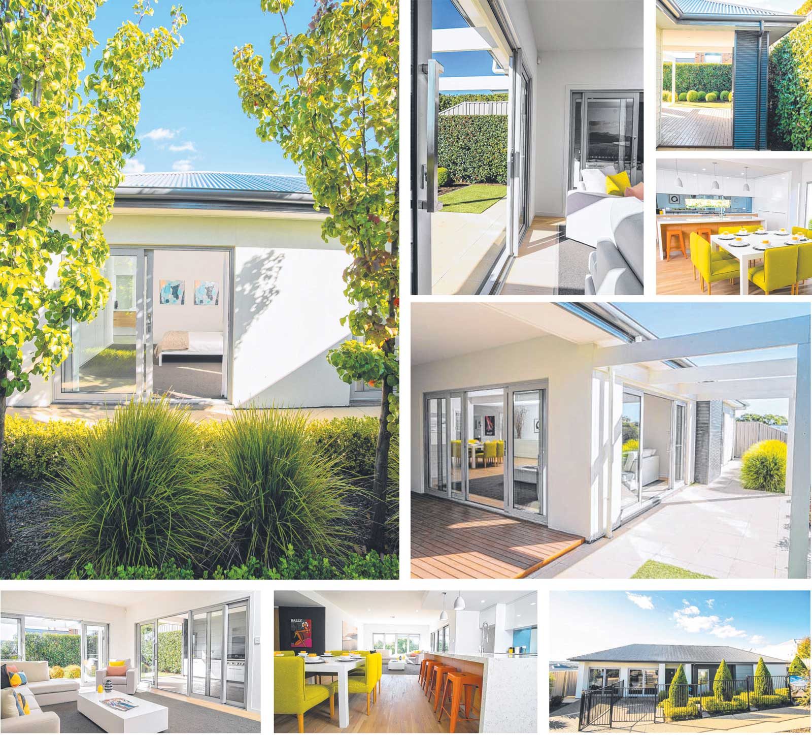
As we look to our gardens and suburbs for solace, we can expect to see our homes integrate a similar connection to nature moving forwards. That's where a design like Gallery Living's Miro 280 is already a step ahead

Miro 280 - connect with nature

Staying home for the past six weeks has taught me many things , but one of the biggest is how important a connection to nature is for your wellbeing. It seems I'm not alone in that mentality either, all you have to do is look at the amount of people gardening and going for walks throughout the day. Experts refer to this connection as 'biophilia' and moving forward , it's an idea that will likely influence the way we design our homes.

When it comes to homes that encourage this connection, Gallery Living's Miro 280 is already a step ahead. On display at Aston Hills estate at Mt Barker, this unique four-bedroom, two-bathroom design positions every bedroom and living space so it connects to a tree-lined courtyard or garden space - instead of just a side fence or a neighbouring property. The result is a burst of fresh greenery through every window and it certainly creates a magnificent outlook and is something to aspire to.

Gallery Living's marketing manager Jaye Smith says the way the Miro 280 works with the surrounding landscape makes it a particularly out standing home to live in. "The Miro 280 has a strong integration with outdoor spaces thanks to the central courtyard, gorgeous sliding doors throughout the living areas and full height louvre windows," she says. "It can completely open up all the living spaces to the outdoors as well as from the master bedroom."

Designed to suit a traditional sized allotment with a minimum 18m frontage - including a double garage - Jaye says the Miro It's a well considered family home, designed with a young family in mind," she says. "The home is zoned extremely well with limited hallways and sunlit areas throughout, with passive surveillance but separation happening at the same time." The layout of Miro 280 is designed around two central courtyards, with a living area, master bedroom and ensuite, and double garage in the first half, and beyond the courtyards, an open plan living, three bedrooms, laundry and bathroom.

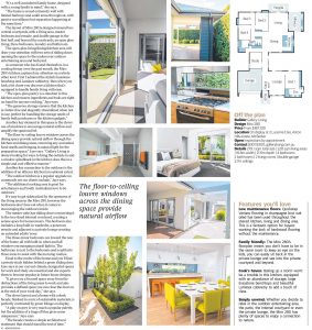
The open-plan living/dining/kitchen area will draw your attention with two sets of sliding doors opening the space to the undercover outdoor entertaining area and backyard. As someone who has found themselves in a cooking frenzy over the past month, the Miro 280's kitchen captured my attention on a whole other level. First I admired the stylish Essastone benchtop and Laminex cabinetry, then when you look a bit closer you discover a kitchen that's equipped to handle family living with ease.

"The open-plan pantry is a standout in this kitchen and ensures ingredients and tools are right on hand for anyone cooking," Jaye says. "The generous storage ensures that the kitchen is clutter-free and elegantly streamlined when not in use, perfect for handling the storage needs of family bulk purchases or the kitchen gadgets."

Another key element in this space is the clever use of windows to encourage natural airflow and amplify the spacious feel. "The floor-to-ceiling louvre windows across the dining space provide natural airflow through the kitchen and dining areas, removing any unwanted food smells and bringing in natural light for the preparation space," Jaye says. "Gallery Living is always looking for ways to bring the outside in and a window splashback in the kitchen does this in a simple and cost-effective manner."

Another key connection to the outdoors is the addition of an alfresco kitchen (an optional extra). "The outdoor kitchen is a popular upgrade we commonly see our clients include," Jaye says. "The additional cooking area is great for entertainers and South Australians love to be outdoors."

It's easy to get sidetracked by the openness of the living areas in the Miro 280, however the bedrooms don't lose out when it comes to encouraging the outdoors inside. The master suite has sliding doors connecting it to the tree-lined internal courtyard, creating a serene space for homeowners. The bedroom also includes a long built-in wardrobe, a generous ensuite and adjacent is a private lounge creating an extended adults' zone. The three minor bedrooms are toward the rear of the home, all with built-in robes and tall windows encouraging natural light in. The bathroom is next to the bedrooms and is split into three areas to assist with the morning routine.

Head to the centre of the home and you'll find a private study hidden behind a green sliding door. Jaye says in our current climate, designated spaces for work and study are essential and she expects them to become popular in future house designs. "It gives you a focused space away from the distractions of the living areas to work and also provides a defined space you can close the door on at the end of your work day," she says.

The clever layout and a home with a sleek facade, finished in a mix of sustainable materials, is perfectly contrasted by green foliage on display. "A play on grey is very much a popular palette, but the addition of a tinge of blue gives some uniqueness," Jaye says. "The facade creates a simple architectural statement that should stand the test of time."


10-May-20 - The Sunday Mail Home Magazine 

Find out more about the Miro 280


Designed with sustainability in mind

Monet 195 is Designed with sustainability in mind

Designed with sustainability in mind

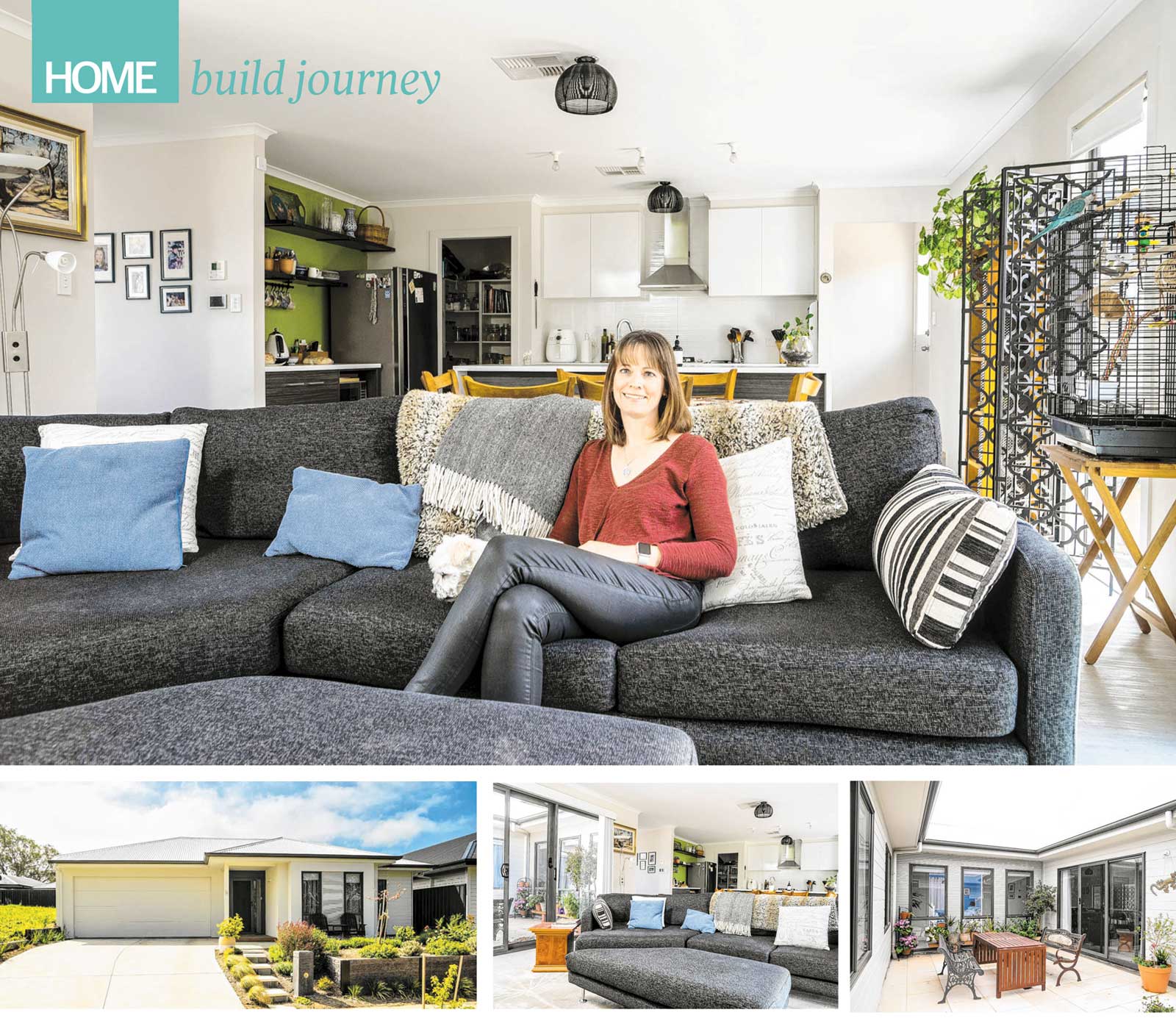
Finding a home that would be energy efficient, and spacious enough for a family with three children was easy once this homeowner chose to build with Gallery Living.

Monet 195 is Designed with sustainability in mind

Rising living costs are encouraging many of us to investigate energy efficient measures to save on household bills. While simple things, such as swapping light globes, are a good start, Johanna Milbank wanted to achieve much bigger savings when she built a home for the first time.

"I wanted to build a home that was energy efficient - one that maximised the amount of sun in the living areas to reduce heating costs but still have the house stay cool in summer to reduce cooling costs," she says. "That was my main driver (when choosing a home design). And it's also why I went with (builder) Gallery Living - they were pretty much the only bulk builder around that designs energy efficient homes."

After visiting several display homes, Johanna fell in love with Gallery Living's Monet 195, a four - bedroom (or three plus study), two -bathroom design with a central courtyard. Slightly modified to fit her Mt Barker block, and better suit Johanna 's ability to occasionally work from home, the Monet 195 also features an open kitchen-dining-living zone.

"The main thing I liked about the Monet was the courtyard and how the rest (of the home) was designed around that courtyard aspect," says Johanna. "But I also wanted to make sure we put the office up near the front door, so if I had clients coming they didn't have to come through the rest of the home."

Johanna says it took about eight months to build the home with only a few minor glitches along the way, including the wrong laminate being installed on the kitchen counters. But any problems were quickly remedied and Johanna describes the build process as "pretty smooth".

The mother-of-three, who has two adult children as well as a 12-year -old daughter, moved into their new home almost two years ago. While the home initially had a fairly neutral colour scheme, Johanna has recently introduced a brighter colour palette, including an apple green feature wall in the kitchen.

"I've also used red on a feature wall in my daughter's room, which looks really good," she says. "I've never done strong colours before. It used to be all white because I like that light, airy, bright feeling. Now I'm introducing a bit of colour - but not too much. I still want to keep that nice, white, bright look but this just brings a touch of interest to it."

While mother and daughter are thrilled with the home as it is, Johanna hopes to do more work to her garden, which includes an area for roses and wicking beds for vegetables. She also hopes to install solar panels to further improve the energy efficiency of the home.

The design has already reduced her heating and cooling costs and has also had other unexpected benefits. "The window placement and the (natural) light coming in give a really lovely feel," Johanna says. "I've even noticed the plants in the house grow really well - they love it too."


15-Mar-20 - The Sunday Mail Home Magazine

The Monet 195 is no longer in our range please see Monet 200 for a similar house


The best of both worlds

The best of both worlds

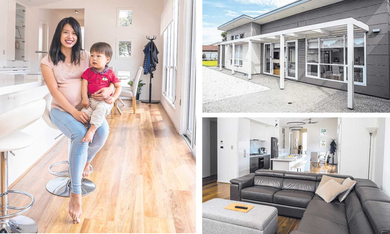
When a young couple wanted a design that was both practical for a growing family and eco-friendly, they turned to Gallery Living for help with building their ideal home

Picasso 250 the best of both worlds

FEATURES YOU'LL LOVE

Lofty feel: The highest point of the Picasso 250 raked ceiling is 3.6m, which amplifies the natural light in the home and increases the feeling of spaciousness.

Environmental edge: An em-friendly home not only ensures you're doing your bit for the environment. it also means the ability to cut costs on energy bills - which can be as simple as thinking about which way your home faces.

Nice 'n' bright: Large windows and sliding doors. plus well-placed feature windows near the dining room, allow natural light to flood through the home creating a warm and inviting home.

Cut costs: Yvonne says using hebel and hardywood plants instead of bricks "saved us quite a substantial amount in footings during the build process".

When Yvonne Tee and Wei Yang Ng planned to build their first home, they had a list of requirements they wanted their design to meet: an open concept to allow for their growing family, a design that was practical and simultaneously as eco-friendly as possible. Sifting through various builders, the northern suburbs couple decided to visit Gallery Living's displays after a friend shared his positive experience with the builder.

Drawn to the Picasso 250, the couple initially wanted to make drastic changes in order to meet their requirements, before realising the design's simplicity was what made it such a standout. "As novice homeowners, we did try to make radical changes to the design but soon realised the builder's plan had a practical simplicity that was difficult to match," Yvonne says.

"However, we worked closely with the builder to tweak the design slightly by changing the location of the study, the alfresco and laundry rooms, and a garage notch extension for motorcycle parking." The family of five, with son Edric, recent addition Henry and tabby cat Tango, fell in love with the seamless mix of contemporary architecture with an eco-friendly design. "The main highlight was the raked ceiling which allowed plenty of natural light indoors, and our plot suited this with its north-sided placement of windows and glass sliding doors," Yvonne says.

Designed for a traditional -sized allotment , sitting 14.3m wide, the four-bedroom home makes the most of the space available. The concealed front entry leads into a foyer, with a lounge tucked at the front of the home along with the master suite, which features an ensuite with a lavish double shower.

Walking down from the foyer, the home expands to reveal the dining, kitchen and living area, a functional open plan space with raked ceilings and an abundance of natural light. The inclusion of sliding doors opposite the kitchen and off the lounge area allow the space to be completely opened out - ideal for entertaining and making the home feel even more spacious.

A hidden hallway behind the living area reveals the three remaining bedrooms, nestled around the laundry and bathroom, complete with a double shower, a bath, a separate vanity and a toilet. With a build process of nine months, the couple was able to move into their new home just before Edric was born.

"The original handover date was March 2016 and the final handover was early June 2016 due to some complications during the build out of the builder's control," Yvonne says. "(Gallery Living) was very flexible and accommodating to our questions and requests." Despite the delayed final handover, Yvonne says as far as first builds go they couldn't be happier, and have now lived in their home for just over two years.

"It's a very simple and comfortable home; it has a bit of a resort feel to it because of the high raked ceilings and large sliding doors," she says. "We also get compliments about the house, which is nice!" The couple says their home is great for entertaining, with sliding doors from the lounge area opening to an alfresco which overlooks the manicured backyard.

"Since moving in, we have hosted a number of guests - the open concept allows up to a dozen people in the house as we use the dining, kitchen and living areas at the same time," Yvonne says. "We also have a barbecue set on the alfresco area, a must for parties!"

Given the chance to build again, Yvonne says there's a few minor details they would change but in terms of a first build they couldn't be happier with the result. "Our son loves to go out to the garden for walks and just explore the area. We have planted fruit trees and have a vegetable patch to grow our own vegies," she says.

"We are happy with how the house turned out - it is perfect as it is for now."


02-Jun-19 - The Sunday Mail Home Magazine

Find out more about the Picasso 250 (South)


A welcome change

Monet 195 a welcome change

A welcome change

After finding a block in the right location, this homeowner needed to find a design to fit its wide dimensions. Enter Gallery Living's Monet 195

Monet 195 a welcome change

Building to meet the requirements of an unusual shaped block can be a challenge, but for a southern suburbs homeowner it was a process made a lot easier with the help of a flexible home builder. When a block came up for sale in her favourite location, she knew she wanted it. The next step was to find a home design that would fit its wide dimensions.

"My land was very wide and not very deep. I chose the land I liked rather than finding a design and then looking for land that would accommodate my design," she says. Deciding to build with Gallery Living, the homeowner says the sales consultant proved to be most helpful, customising one of their standard designs to suit the requirements of her block and accommodating her wishlist and requests.

"Most designs suit a narrow frontage and longer block, I looked for a design I could turn around but that would still have street appeal," she says. "I looked through all of Gallery Living's display homes and this design had a warm, homely feeling to it.

"I chose to build with Gallery as I had previously built with Sarah Homes, I knew how they worked and I was happy with the build process last time." Based on Gallery Living's Monet 195 design, the homeowner was drawn to the zoned living of the four bedroom two bathroom home, which was ideal for her busy family.

"I liked that I could have my end of the house with a bedroom, ensuite and office, and the kids have the other end with their bedrooms and bathroom," she says. With a build process of about 10 months, the homeowner says there was a slight hiccup at the beginning which Gallery Living were quick to smooth out.

"Building can be stressful, it's not for everyone, I visited the site everyday to have a quick look and make sure everything was as I expected," she says. "There was an initial hold up with the site levels being incorrect and an amendment being submitted to council, and this held up the build for about four weeks. "Zenon, the site supervisor, caught up this time and my move-in date was a couple of weeks earlier than expected."

Inspired to create a relaxed feel within her home, the homeowner chose earthy tones to create a warm, welcoming interior. "I chose to have the rust colour on the Hebel, together with the greys on the weatherboard and Colorbond," she says. "For the interior I wanted a relaxed boho feel, with colours that were easy care having kids and pets."

The entrance of the home leads to an open family lounge, which flows on to the monochrome L-shaped kitchen and the dining area, with beautiful statement pendant lighting above the island bench and dining room table.

The spacious master suite has an ensuite, with a bath and a double shower, and feels like a private oasis from the rest of the home - a favourite feature of the homeowner. "The master bedroom is my sanctuary, the design I chose didn't have a bath in the house, so I chose to add a bath and put it in my master suite," she says. "I have recently repainted the room and it has a beautiful relaxed feel to it now."

The family has now lived in their home for just over a year and a half, and the homeowner says it has been ideal for entertaining and enjoying time with her two children. 'We are very happy with the house and I expect it will meet our needs until my children are grown up," she says. "In summer we spend a lot of time at the beach and in winter we walk or cycle around the town. I commute a fair way to work, but it is worth it to live in such a beautiful house and area."


10-Mar-19  - The Sunday Mail Home Magazine

The Monet 195 is no longer in our range please see Monet 200 for a similar house.


Eco-friendly living, with a modern edge

The Warhol is Eco-friendly living, with a modern edge

Eco-friendly living, with a modern edge

The choice to move into an eco village had its challenges along the way, but once this family found the right design and builder to suit their unusual block, it was a fast build and a smooth process.

The Warhol is Eco-friendly living, with a modern edge

Living in an eco village is not just about minimising the environmental footprint of your home, but also about adapting your lifestyle to become more communal. For southern suburbs couple Tim Paul and Naomi Hughes it was the sense of community that drew them to build a family home in the Aldinga Arts Eco Village.

"We love the vibe and the community in this area, and I believe we have one of the best beaches the Fleurieu has to offer," Naomi says. Living with their children Ryder, 11, and Seren, 2, plus Rex the dog, Baxter the cat and Buddy the bearded dragon, the family wanted a four-bedroom, two-bathroom home that worked with their lifestyle and their conscious choice to minimise their environmental impact.

"We really wanted a good sense of space with open areas that could also be closed off for privacy," Naomi says. Their home also needed a private home office for Naomi's therapy work as a transpersonal counsellor. "We also really wanted a separate children's wing where they had their own space with their own bathroom," she says.

When searching for a builder, the couple needed to consider the Eco Village's requirements and the shape of their unusual allotment, which initially proved difficult. "Our block is kind of like a sloped trapezoid with the widest part being at the bottom, it was a little tricky to get (a house) to fit well and as a consequence we have an odd shaped yard - but with all the common land around us we didn't mind at all," Naomi says.

The couple started looking at Gallery Living's designs which are all planned with good orientation and cross ventilation in mind. Originally falling in love with Gallery Living's Picasso design, Naomi says they couldn't quite get the design to work with their allotment despite their best efforts.

"We just loved the Picasso and no matter what we did we just could not get it to fit on to the block," she says. "Years ago I also fell in love with a Longridge home and this is Gallery Living's adaptation of that design, (the Warhol 245), now with our slight adaptations."

The family's customised Warhol 245 has a unique floorplan that looks like an H shape, with two main wings on either side of the entrance which sits in the middle of the design, adjacent a central lounge that looks out to the backyard.  The design has four bedrooms along one wing, plus a study and two bathrooms, and a discreet laundry. The other wing houses the double garage and a long, large living zone comprising the dining room, kitchen and another lounge.

After settling on the design, the couple say they found Gallery Living were very flexible with modifications to ensure their build met the requirements of the Eco Village standards. "Our designer had an interest in energy efficiency and as soon as we had our first meeting we knew we were in good hands," Naomi says.

These requirements included the installation of non-PVC pipes, a minimum 20,000 litres of rain water storage and only using sustainable building materials, along with other recommendations such as north-facing living spaces, good crossflow ventilation, solar energy and double glazed windows.

With a fast build time of only four months, the family found Gallery Living to be extremely accommodating to any requests for changes. "Our designer and site supervisor were both very accommodating to our needs and also great at outlining the issues involved if something wasn't possible," Naomi says.

Having lived in the property for more than 12 months, the family has completely settled into their new way of life at the Eco Village and are over the moon with the finished result. 'We all have our space and we can all come together in these spaces, the house has a great balance of functionality, aesthetics and comfort that suits everyone," Naomi says.

"It's very comfortable and always gives that real sense of coming home when we pull into the driveway."


15-Jan-19  - The Sunday Mail Home Magazine

This exact house model is no longer available, to see a similar house please view the  Warhol 250.


Family life

Monet 265 perfect for family life

Family life

Room to spread out and enjoy an indoor/outdoor lifestyle

Monet 265 perfect for family life

Families come in all shapes and sizes. So its lucky family home designs aren't all the same. Big families may want lots of bedrooms and separate living zones and a good-size garden, others may prefer open-plan living to share with children, and some may like the flexibility of two-storey designs which add valuable living space on smaller blocks.

Three bedrooms, plus study/fourth bedroom, two bathrooms, two living zones, courtyard, double garage design.

Why we like it:
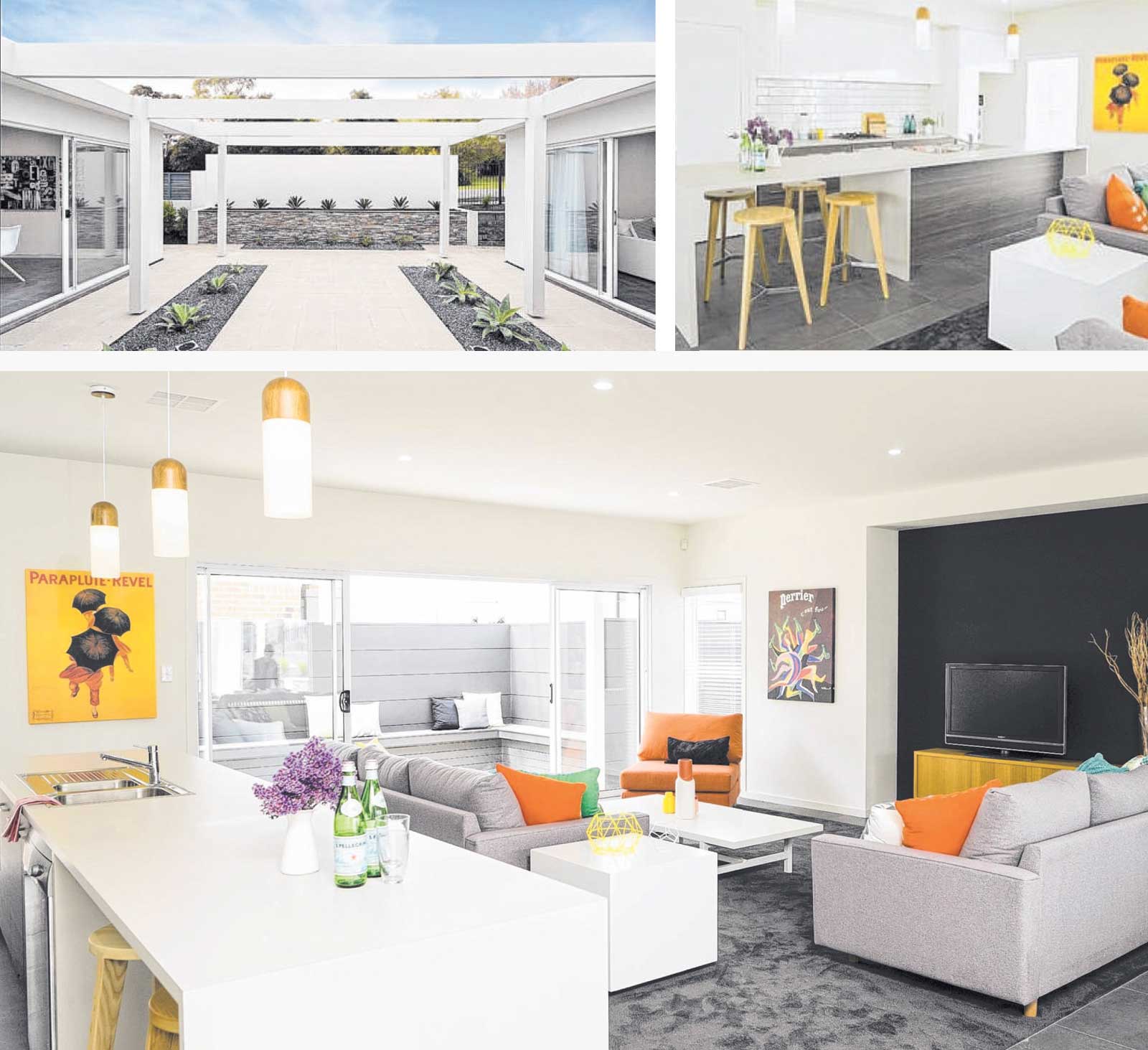
When you have a design with a choice of outdoor areas directly off two main living zones, it's an immediate plus for parents who need to keep an eye on children, but want them to have the freedom to roam outside in a safe, secure environment. Well, the 263sqm size Monet 265 does just that.

It looks out to the internal courtyard from both the front lounge and the open -plan living, which also has the bonus of a rear-facing alfresco. This flexible three-bedroom home (ensuite to the master) also has the option of a fourth bedroom, which in the Mt Barker display is shown as a study, so there 's the choice to have more bedrooms if required or three living spaces if not.

Good storage is a family essential and is well integrated throughout, and the galley-style kitchen offers a huge island bench for casual meals, prep and entertaining will be a pleasure.

A kids' wing, large living zones, an energy efficient design and polished contemporary bathrooms are among the Monet 265's other bonus points.


15-Jul-18 - The Sunday Mail Home Magazine

This exact house model is no longer available, to see a similar house please view the  Monet 230.