The right orientation
Energy efficiency and everyday practicality combine in the contemporary Picasso 250 design by Gallery Living

FEATURES YOU'LL LOVE
Niche work: In the family living. a niche streamlines the TV and entertainment unit creating direction for your furniture placement.
Light and appealing:
You'll enjoy how light the home feels and how naturally warm it is as well.
Height and style:
Who can go past the raked ceiling and the highlight windows.
When choosing a new home, it pays to think about the long-term. How expensive will the home be to heat in winter or to cool in summer? Will it have good light throughout the day, and will it make the most of the view or aspect you have? All things considered, finding an energy efficient design that will help reduce your longterm bills and create a nice living environment is an ideal combination.
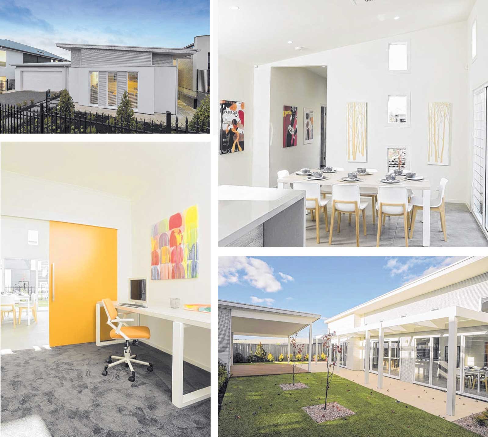
So look no further than Gallery Living's Picasso 250 design. Contemporary in looks, with a high-pitched skillion roof, a wall of windows and doors and a longish design, the Picasso 250 is all about bringing eco living to suburbia. This is the largest Picasso in a range of size variations, and the 250 showcases the design with one side facing north and the garage - which is a separate building - angled slightly in line with the block's shape.
Inside there are three bedrooms, a study, two living areas and two bathrooms plus a pergola and walkway link to the double garage. On the outside the home has been dressed in whiteish -grey tones and just as many of us will wear light or white colours on hot days, it gives a cool, fresh impression.
The front door isn't immediately obvious from the street, and instead it sits back a little way, past the garage and front living room, with a side facing entry point. It's a feature I rather like as it gives that extra element of privacy - and it means you'll be able to leave the door open (security screen door still locked, of course!) to let sunlight or a breeze in without worrying that everyone going past can see inside your home.
The Picasso 250 does feel very private inside, with a series of long but narrow windows providing good light, and the focus is most definitely on the side-facing yard. The 15m-wide design is displayed on an angled block, but even on rectangular blocks, it will provide a decent-sized backyard behind the garage.
Its connection to the indoors via wide sliding doors and full-length windows is emulated throughout the design, with an easy flow of living zones along one side of the design and sleeping quarters running the length behind these main rooms. Gallery Living's sales manager, Russell Slater, says the Picasso 250 is one of the brand's most popular family homes.
"The Picasso design is a signature home for us and was designed to be a clever hybrid of highly energy -efficient 'eco' homes with the practicality of the modern family home," he says. "Energy -efficient home designs are rapidly emerging from niche interest to increasingly becoming a vital component of everyday family homes."
Built with lots of glass, high ceilings (2.7m rising to 3.Sm) and good insulation, and with louvre windows being used to their full advantage and for cross ventilation, the choice of materials for Gallery Living homes is one of the key differences of the brand, Russell says. "One of the principle benefits of avoiding using materials that retain heat for a long time - for example, concrete roof tiles and clay bricks - is that we can dramatically increase the glazing ratios of our living areas," he says.
"In winter this allows a large amount of light to stream in and warm the slab - the key thermal mass of the home. It's very rare for us to heat this home during winter days. "Also by using an external pergola with timber slats, we block the higher summer sun from coming through the northern windows, resulting in minimal use of air-conditioning. Plus, it's just lovely to live in an open, light home."
The Picasso 250's two living areas are a contrast: the front lounge is large but cosy, with lush carpet and black walls enveloping the space. It feels snuggly and nurturing, and is a space you would retreat to at night or in the middle of winter. The main open -plan zone is long, light and bright and extends from the entry hall, combining the dining, kitchen in the middle and family lounge at the rear. The pitched ceiling rises toward the external wall and it has amazing height, while the white walls and porthole windows add a coastal vibe to this long, leisurely space.
This large zone will be appreciated by families who want to keep an eye on children, whether they are doing homework, playing or watching TV, as well as those who like to entertain. "It's perfect for families - or families to be - who like modern, energy-efficient designs and who place a high value on comfortable living with direct flow from inside to outside," Russell says.
A decked area separate to the house has an outdoor barbecue kitchen. It's a nice change to find an alfresco away from the main building, and this represents one of the many upgrades you can opt for. It's still within line of sight of the kitchen, but that's not a hard task as the kitchen is enormous, with its long island bench dominating the open plan and being the heart of the space.
A double sided breakfast bar at one end gives you a casual eating area, and there's plenty of bench space and a bank of storage on the back wall. "Everything is open and designed to centre around the kitchen," Russell says. "The style is clean and angular, which perfectly captures the light as it streams in." Like the front lounge, a carpeted zone frames the family living and this is a clever way to keep feet warm when you 're relaxing on the couch.
25-Feb-18 - The Sunday Mail Home Magazine
Find out more about the Picasso 250 (South)


